Repetitive patterns signify particular frequency/frequencies. If there are repetitive patterns in an image, the frequencies can be known by getting the Fourier transform of the image. By means of the Fourier space, we have an access to see the frequencies. We can therefore manipulate it, as well.
In this activity, the Fourier transform of different patterns are investigated. This is to demonstrate certain symmetries and relationships upon taking the Fourier transform and using the Convolution Theorem. At the end of the activity, unwanted repetitive patterns in specific images are removed by masking some frequencies in the Fourier domain.
A. Convolution Theorem
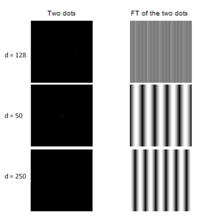
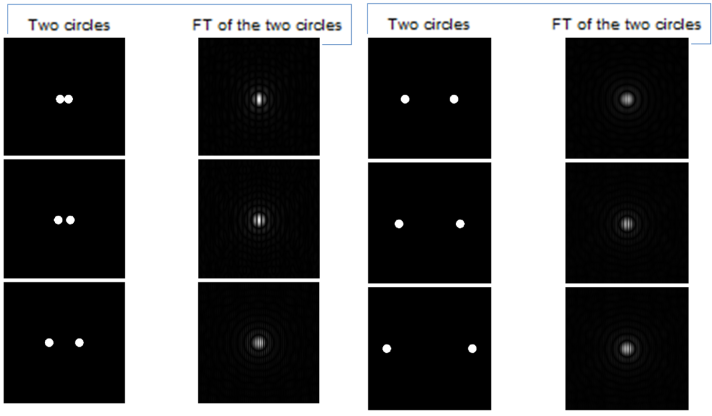
The first task is to create a binary image of two dots positioned symmetrically about the center along the x-axis. These two dots are represented by one pixel each. The next thing to do is to take the Fourier Transform (FT) and to display the resulting modulus. The figure below shows the result for various distance d between the two dots.
The FT of the two dots along the x-axis is generally represented by vertical lines which are equally separated or we can say it has one frequency. We can also say in this case that the lines are perpendicular to the principal axis of the dots. If the window of the image is maximized, these vertical lines are equally spaced. But when the window is small, the vertical lines seemed to have different widths and exemplify a periodic pattern. Moreover, it can be observed that the FT when d = 128 (half of the dimensions of the image since my image is 256×256), the interval of the vertical lines are small. But when d = 50, i.e., the dots are 50 pixels away (extremely near), there are no longer vertical lines but a sine or a cosine function observed atop and the direction is along x, meaning parallel to the direction of the principal axis. This is also observed when d = 250 or when the dots are extremely far away but the frequency are different.
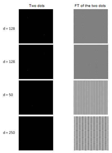
I also checked the corresponding FT is the two dots form a diagonal line out of curiosity. The resulting FTs are actually interesting. These are shown below.
It is observable that the FTs of the two dots which form a diagonal line with d = 128 look like a grid. The patterns formed are similar for same d. Even when the direction of the diagonal is different, the pattern is robust. Unfortunately, I cannot see the direction of the grid whether it is along x or y-axis. When the d is extremely small, the pattern is a still a grid with smaller cells. In the image above, these look like fringes or vertical lines but zooming in uncovers the grid patterns. I also expected a grid pattern for FT of two dots with d = 250. However, the result looks like a set of stacks of coins which makes a dizzy appearance. In general, we can think of the dots as Dirac delta and the FT is a sine function with one frequency.
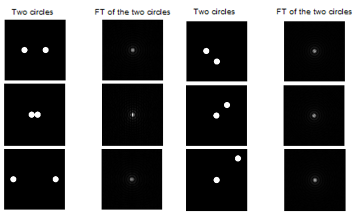
The next step was to replace the dots with circles. The FT of the image is again taken and investigated. The results are shown below.
When the circles are fairly far from each other and along the x-axis, the formed FT is like an Airy pattern but there are fringes or we can say there is a sinusoid. I find it quite surprising because I haven’t tried using a circle as a PSF. If we come to think of it, this case is like the combination of the dots (Dirac delta) and circle or the convolution of them. Therefore, the resulting FT is the combined FT of the circle (Airy pattern) and sinusoid with one frequency (which was previously observed in the two dots). When the two dots are so close to each other and along the x-axis, the result is similar from the first case of the circles but the frequency is lower and the spread of the Airy pattern is wider. The FT for the circles which are extremely far from each other and both are along the x-axis, the frequency is high and almost similar to the circles which are faily far from each other.
Again, I rotated the principal axis. I was expecting a grid pattern with Airy pattern. It is like multiplying the Airy pattern to the grid pattern. And the result was the same with my expectation. The good thing about it is that I have seen the direction of the grid pattern. When the diagonal is going down to the right, the grid pattern is dominantly directed to the right and downwards. It is like there is still the dominant sinusoid following the direction of the diagonal. When the distance of the circles is very large, the grid pattern gets finer.
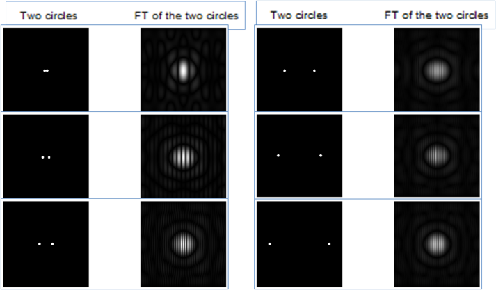
As I made the radius of the circles smaller, the FT also changed. We can see it from the figure below.
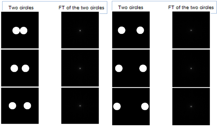
Here are the results when the radius was made larger.
And here are the results when the radius was made extreme large.
We can immediately see from the figures above that when the radius of the circles are very small, the span is of the Airy pattern is very wide. As they go larger, the span becomes smaller. From this observation, we can say that the size of the circles in the real space is its inverse in the Fourier space. Moreover, the fringes are more defined when the size of the circle increases. As an additional information, when the distance between the circles is very small, the fringes are not perfectly circle. As it reaches a certain distance, the fringes become circular and these become distorted again when the distance between the circle goes beyond that certain distance. If I the principal axis is not along the x-direction, the sinusoid pattern will be changed to grid pattern.
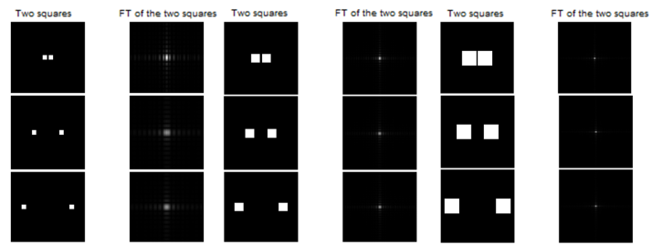
The next step is to replace the two dots by two squares. The results are shown below.
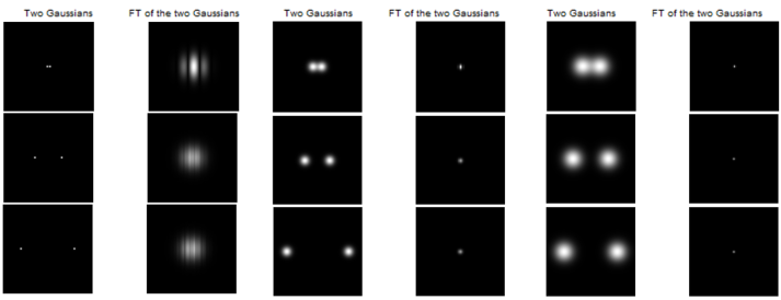
The next step is to replace the dots with Gaussians and vary the variance and mu. The results are shown below.
We can observe that the results in the square and Gaussian images have similarities. If the size of the shape (square, Gaussian) is very small, the span of the pattern of the FT is bigger. Otherwise, the pattern of the FT is smaller. This signifies an inverse relationship in the size of shape and the FT just like what was observed in the circle. Still, fringes (sinusoids) are observed in the FTs of the images.
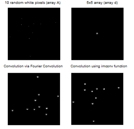
The next step is to put white pixels at random positions in 200×200 pixels black image. This is eventually convolved with a 5×5 pattern using the Convolution Theorem. In order to check if my results are correct, I also showed the resulting image using the function imconv of Scilab which executes 2D convolution. The summary of my results are shown below.
In convolution, we can see from the resulting images that the 5×5 array is “multiplied” to the 200×200 array with random white pixels. I observed that in the convolved image using imconv, my 5×5 array is inverted and located to the particular positions of the random white pixels. However, using the Convolution theorem, similar result was produced but the distribution of the positions of the small 5×5 arrays is inverted. The appropriate usage of fftshift could correct it because without using fftshift, the processed image is still not the same with the imconv result. I think the size of the 5×5 matrix which is odd gives the symmetry to this matrix and therefore made it possible to replicate this matrix upon convolution.
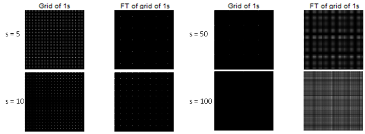
The last procedure for this part is to make a 200×200 black image with equally spaced white pixels along the x- and y-axes. The FT of this image was asked. Variation of the spacing of the white pixels was also done and investigated. The summary of the results are shown below. The s stands for the spacing of the white pixels in pixel units.
We can see from the figure above that when the lattice of white pixels has small s, the FT has big s. If the lattice has big s, the s of its FT is small. This demonstrates an inverse relationship which was also observed from the previous distribution (circle, square, Gaussian). The size of the real image is inversely proportional to the size of the span of the corresponding FT.
B. Lunar Landing Scanned Pictures: Line Removal
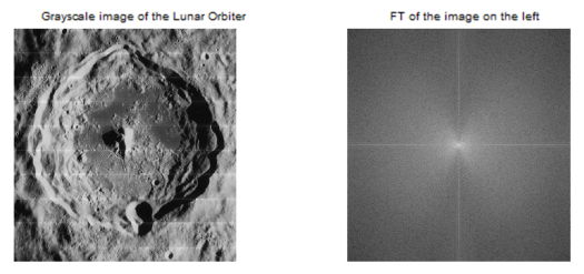
The first step for this part is to download the Lunar Orbiter Image with Lines.jpg from AP 186 UVLE and to open in Scilab as a grayscale image. Then the horizontal lines there in the image was tasked to be removed by filtering in the Fourier domain. We can see from the figure below that the grayscale image has (unwanted) horizontal lines and by Fourier transform, this will be enhanced. The image below shows the grayscale image of the Lunar Orbiter and its FT.
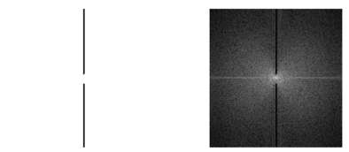
In the image to the left, the unwanted lines are horizontal. We can think of it as a sinusoid based on what we have observed in the circles. Hence, the unwanted frequencies in the Fourier space will be along a set of vertical lines. The mask that I will design should then be consisting of vertical lines. I used MS Paint to draw the mask and it is shown below together with the FT image of the graycale Lunar Orbiter image.
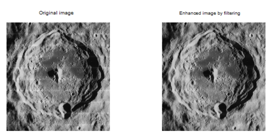
Then this mask is multiplied element by element to the fftshift of the grayscale image. Taking the inverse FT of the result gives the enhanced image. This is shown below together with the grayscale image of the Lunar Orbiter for comparison.
The horizonal lines are now removed. Amaziiing!
C. Canvas Weave Modeling and Removal
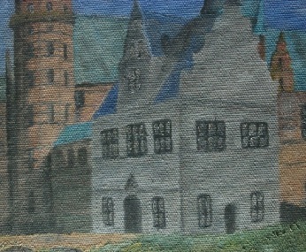
The procedure here is to download the 185-8526_IMG.JPG image from AP 186 UVLE and crop a square section from this image. It is shown below.
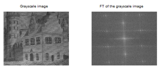
This will then be opened as grayscale image. Then a filtered mask is required again to remove the weave pattern in the image. The grayscale image and its FT are shown below.
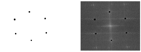
I then masked the high frequencies around the central point in the FT of the grayscale image. I drew the mask using MS Paint. It is shown below together with the FT of the grayscale image.
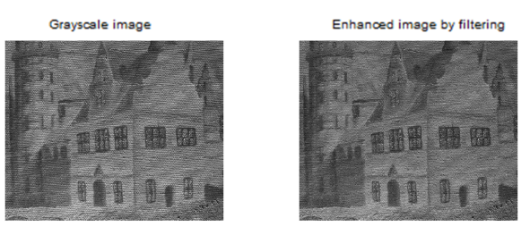
The resulting pattern, upon using the mask and multiplying it element by element to the fftshift of the grayscale image of the canvas and taking the inverse FT, is shown below.
The weave pattern is removed and the image looks flat now, for me. It also looks like slightly retouched or smoothened. The definition of enhanced for me is subjective. For me, the weave pattern gives the image some texture. But in this case, I can say that the image is “enhanced” in such a way that there is no weave pattern anymore but the details of the drawing is still there. I can also say that the brushstrokes became more evident, so it is enhanced.
The last part of this activity is to invert the filter mask and take its inverse FT. The result is then compared to the canvas weave. The inverted filter mask and its inverse FT is shown below.
We can see from the above image that the FT of the inverted mask, particularly the modulus of the FT of the inverted mask, is SIMILAR to the canvas weave in terms of appearance! Hurrah! If we look at it closely, the weave is there. Hence, we can say that we have used a good filter mask in this case.
I will give myself a grade of 10/10 in this activity because I did every part, I understood the lesson and I enjoyed doing it. 😀
References:
1. Maricor Soriano, “A6 – Enhancement in the Frequency Domain”, 2012.

i like this subject and it will help me a lot with my homework. thanks for helping.http://www.divulgaemail.com