AP 186 Activity 1: Digital Scanning

Ratio and proportion were already taught as mathematical concepts during the early gradeschool years. Actually, even in the tertiary education, this elementary concept is still utilized. One way is by digitizing an image. By means of ratio and proportion, the image points and the Cartesian coordinates are matched so that one can actually measure the size of an image or a particular part of an image. Digitizing is also very important in the research field especially when collaborators are far from each other. If they need to send large amount of data, they can send an image instead and the other party can digitize it to extract the data. However, one should consider the accuracy of the digitized values.

For this activity, I looked for a hand-drawn graph in the National Institute of Physics library last June 14, 2012. I finally chose a graph showing a curve of current in milliamperes as a function of relative humidity of an electronic hygrometer. I directly scanned the page of the book and it is shown in Figure 1. I acquired the plot from a proceedings entitled “On the Development of an Electronic Hygrometer” from the Proceedings of the Fourth National Physics Congress. The authors were Dr. Caesar A. Saloma and Mr. Enrico G. Yap of National Institute of Physics, College of Science, University of the Philippines-Diliman, Quezon City, Philippines.

It’s a shame that I do not know Mr. Yap. I cannot find a credible source to identify his profession so that I could use a proper name prefix. To be safe, I used the title “Mr.” instead.

The fourth National Physics Congress was held at the University of the Philippines-Baguio on March 31 to April 3, 1985. It was organized by the Samahang Pisika ng Pilipinas (SPP). The compilation of the said proceedings was edited by Mr. Christopher C. Bernido.

Figure 1. Scanned image of the hand-drawn graph from the Proceedings of the Fourth National Physics Congress [1].

The pixel resolution of the scanned image referring to Figure 1 is 2004 x 2724 pixels and its size is 866 kB. However, the resolution of Figure 1 itself in this post is only 300 x 500 pixels for formatting purposes. The scanned image was saved as scanned_plot.jpg. This image was grayscaled (B&Wcommand) using Picasa 3.9.0 by Google, Inc. and was saved as grayscaled_plot.jpg. The image size then dropped to 632 kB with the same pixel resolution. It is shown in Figure 2. Both image formats were JPG (short version of Joint Photographic Experts Group) [2].

Figure 2. Grayscaled image of Figure 1 using Picasa 3.9.0.

I opened the grayscaled_plot.jpg using MS Paint Version 6.1 for Windows 7 Starter afterwards. I used the Select command to crop out the area that I need to measure and to focus on. Upong Select-ing, I noticed that the plot is slightly tilted. That’s why I used Picasa again to correct the orientation. I slightly rotated the plot counterclockwise using the Straighten command. This image was saved and I opened it again in MS Paint for the next step. Fortunately, I found out that the x and y-axes were perpendicular to each other. As can be seen in Figure 1, the authors made use of a guide, maybe a graphing paper, to establish perfect axes. Hence, there will be very minimal room for errors. I then used the Select command to crop the plot so that the lowermost and leftmost point of the image is approximately the origin of the Cartesian coordinate system. The image pixel value will be identified later as I hover the mouse pointer around the image using MS Paint. The x and y-axes I followed were the ones connected to the point (0,0) of the Cartesian coordinate system. The other x and y-axes were actually not perpendicular to each other.

Figure 3 shows how perpendicular the x and y-axes I followed. It also shows that the other axes were not perpendicular. These lines were used to identify the position of the points in the curve. Imperfections such as these are inevitable for hand-drawn graphs. That is why it is very important to use computer programs nowadays to plot numerical values and relationships for accurate display of results. This is one of the benefits of the advancement of technology.

Figure 3. Illustration of how the hand-drawn plot was cropped

On the other hand, Figure 4 shows the cropped plot following the x and y axes connected to the corresponding (0,0) point using Cartesian coordinate system. The image size expectedly dropped to 507 kB with a resolution of 1296 x 1300 pixels. However, the display resolution of this plot in this blog is only 300 x 300 pixels. Note that the origin of the Cartesian coordinate system, point (0,0), has the image pixel location of (9, 1295) px.

Figure 4. Cropped hand-drawn graph which was investigated.

To find how many pixels in the x and y-axes correspond to the physical or actual values of the tick marks of the graph, the actual values were related to the pixel position for each axis. Figure 5 shows the relationships and corresponding linear trends. These were calculated using Microsoft Office Excel 2007.

Figure 5. Linear relationship between pixel locations and axes values.

The two equations from Figure 5 were used to determine the physical values of the points in the curve which in turn used to interpolate points for the entire curve. I chose 19 pixel locations in the curve instead of just the 6 encircled points to get a closer shape of the curve. Figure 6 shows the resulting physical values corresponding to the 19 (x,y) pixel location I chose. In other words, I substituted the 19 x pixel locations to the linear trend for the x-axis and substituted the values of the 19 y pixel locations to the linear trend for the y-axis.

Figure 5. Plot of the interpolated points and the digitized curve.

It can be visually observed that the set of interpolated points were similar to the hand-drawn plot. But as scientists, this observation is not enough. To quantify this relationship, the physical values of the 6 encircled points from Figure 1 points can be compared to the corresponding digitized values of the curve from Figure 6. Table 1 summarizes the said comparison. The second to fourth digitized values were converted into two significant figures so that it will be the same with the physical values. In simple terms, there is no difference between the digitized and the physical values.

Table 1. Comparison of the digitized and physical values of the overlaid plots in Figure 6.

The digitized plot can also be overlaid to the original hand-drawn plot for a clearer and straightforward comparison. I saved the digitized curve in Microsoft Office Powerpoint 2007 using Save as Picture… and opened it again in the same window. In the Format tab, I clicked the Recolor tab in the left in drawing toolbar and chose Set Transparent Color. Then I clicked the white background of the image plot to make it transparent. I then inserted the cropped plot from Figure 4 and clicked Send to Back button in the drawing toolbar. And then I clicked the digitized plot again and overlaid it by clicking Bring to Front button in the same toolbar. There I resized the two images so that they correspond to each other. I superimposed the endpoints of each plot so they will really overlap. I grouped them so that they will be saved in a single image. Figure 7 shows the overlaid images.

Figure 6. Overlaid images of the cropped hand-drawn graph and the digitized curve.

From Figure 7, it can be seen that the curves were really similar to each other. However, they are not perfectly the same. These account for the errors and the 0.9999 correlation coefficients from the relationship of pixel location and physical values from Figure 5. Moreover, the two curves were similar because the hand-drawn x and y-axes were perpendicular.

I recommend that the scanned image be of good resolution so that the correct pixel position will be focused. Pixel position should also be chosen with much care and accuracy.

In this activity, I will give myself a grade of 10/10 because I understood the concept of digital scanning and I think my plot is very near to the hand-drawn plot. I also think that I have done the things that should be done for this experiment. My plots are clear and of good quality.

References:

1. Caesar A. Saloma, Enrico G. Yap, “On the Development of an Electronic Hygrometer” in Proceedings of the Fourth National Physics Congress, (University of the Philippines-Baguio, Philippines, 1985), pp. 111.

2. “Resources”, available at www2.johnson.cornell.edu/currentstudents/logo_template.html.

3. Maricor Soriano, “A1 – Digital Scanning”, Applied Physics 187 laboratory manual 1st semester AY 2012-13.

AP 186 Activity 12: Basic Video Processing

Video and Audio

Video and audio refer to storage formats for moving pictures and sound, respectively, which changes through time. Recording a video or audio is also known as video or audio codecs. Video codecs comprises of a series of images, or frames while audio codecs commonly comprises of a single channel or mono, two channels or stereo or more. The quality of videos depends upon the number of frames per second, the resolution of the images and the color space used. On the other hand, the number of bits per playback time, or bitrate, determines the quality of audio [1].

Video and audio are used to develop family videos, presentations, web pages and others. It is recommended by the Web content accessibility guidelines to provide alternatives for this kind of media like captions, descriptions or sign language when producing videos all the time [1].

Video and audio are formulated to improve experiential learning or entertainment.

Video is a series of still images presented in a fast succession so that there will be a perception of motion by the audience [2]. Observe the image below.

Figure 1. A GIF image of a dog [3].

A video can either be analog or digital. In this regard, the image processing techniques we have learned can be applied to the ‘still’ images. The frame rate for a digital is known as fps or frames per second. By taking the inverse of fps, we get the time interval between frames or the Δt [2].

This activity revolves around basic processing of a video. The audio here is omitted.

In particular, dynamics and kinematics of a specific system will be extracted from a video [2].

Important note: If an image seems to be indistinct, simply click that image for larger view. 😀

Kinematic Experiment

A video of a kinematic experiment, specifically 3D Spring Pendulum, is the subject for this activity.

A 3D spring pendulum consists of a spring-mass system with three degrees of freedom. Having such, its behavior becomes chaotic. For a simple pendulum, the string length is constant giving rise to a constant period. However, the length of spring in a spring pendulum changes every time [4].  Below are some examples of chaotic behavior.

Figure 2. Chaotic behavior of two 3D spring pendulum systems. a from [4], b from [5] and c from [6].

Materials and Setup

The materials used are iron rod, clamp, spring, 20 g mass (actually 19.1g), Canon D10 camera, tripod, FFmpeg software, laptop, red pentel pen and masking tape. The assemblage of the first four materials is  shown below.

Figure 3. 3D spring pendulum (drawn using MS Powerpoint).

The digital camera was used to take the video of the kinematics and the software for video processing. The red pentel pen and masking tape were used to ensure that the color of the mass is unmistakably different from the background.

Procedure

The first step is to take a video of the actual 3D spring pendulum system in motion. The video showing the system along the side of the setup can be found here:

http://www.mediafire.com/download.php?6xfzap395c99w6z

The frame rate of the video is actually 30 fps. FFmpeg was used to extract images from the video above. This program was ran using command prompt and following the format:

ffmpeg -i <filenameofimage> <filenameofsavedimage>

The 141st to 150th frames/images from the video are shown below.

Figure 4. Sample images extracted from the video above (141st to 150th frames).

Since the images were now extracted, image processing techniques can be executed. Here is my plan to get the position of the mass:

  • loop through images
  • image segmentation (parametric and non-parametric then choose the better one)
  • get the pixel position of the centroid of the blob
  • append the pixel positions to an array and plot the track of the mass in 2 dimensions

So the next thing I did was to do Image Segmentation. But here’s the problem: I found out that the iron rod was also included in the segmentation! 😦 Since the mass was white and specular reflection occurred in the iron rod, the segmented images contain the iron rod as well. I cropped out the image so that there will be no more problems. However, some of the pebbles were also included! 😦 I used FastStone Photo Resizer 3.1 to crop and edit the images by batch. We were not careful about the color of our subject that is why we have to deal with this problem.

Figure 5. Cropped version of the image from Figure 4.

What I did was to segment the images first. The segmented version of the images from Figure 3 using parametric segmentation are shown below.

Figure 6. Parametrically segmented images corresponding to the images in Figure 5.

I thought of using morphological operations for the images above so that I can isolate the biggest blob. However, I still have another choice. That is, non-parametric segmentation. Figure 7 shows the corresponding segmented images using non-parametric segmentation.

Figure 7. Non-parametrically segmented images corresponding to the images in Figure 5.

By inspecting Figures 6 and 7, we can see that non-parametric segmentation produced better results so I used it for the next step. The next thing we need to do is to get the centroid of the ROI (region of interest) which is the mass so that we can know its pixel position in the image.

By the way, segmentation was done with ease because I looped through the images. 😀 The processing is simple but running the code took a very looooong time. The video’s length is 3 minutes 11 seconds but I only processed the first minute. That means I looped through 1800 images in order to produce both the parametrically and non-parameterically segmented images. 🙂

[Going back to the discussion] I made two empty arrays from the beginning of my code: posx and posy. See the last figure for my Scilab code. When the centroids of all the images were taken, the x and y positions are binned in posx and posy, respectively. In the end, posx and posy are plotted against each other. The result is actually the track plot and it is shown below.

Figure 8. Track plot of the mass in the pendulum from the video above (170 frames).

The plot from Figure 8 shows the track of the mass using 170 frames only so that it will be presentable. Too much frames will show more lines that might conceal the directions. We can see from Figure 8 that the path of the mass is chaotic and similar to Figures 2a and 2b.

We took another video of the 3D spring pendulum but this time, its motion is viewed from the bottom of the setup. It can be found by clicking the following link:

http://www.mediafire.com/download.php?p86nd84r95zcjyh

The 141st to 150th frames are shown below.

Figure 9. Sample images from the second video (141st-150th frames).

I did not have a problem segmenting the images from this scene since the mass here is covered with masking tape applied with red pentel pen ink. (Thank God.) The parametrically segmented images corresponding to the 141st to 150th frames are shown below for sample images.

Figure 10. Parametrically segmentated images corresponding to the images from Figure 9.

and the non-parametrically segmented images are shown in the next figure.

Figure 11. Non-parametrically segmented images corresponding to Figure 9.

Again, the non-parametrically segmented images were better than the parametrically segmented ones just like in the case of the first video. I then looped through the images and took their centroids to determine their positions per image. The plot of the positions are shown below.

Figure 12. Track plot of the mass in the pendulum from the second video (100 frames).

The plot from Figure 12 shows the track using 100 frames only. Adding more frames will show more chaotic plot. Once again, the track of the mass is similar to the track illustrated in Figure 2. We can account the difference from the fact that it is not ideal and by presence of air drag, spring constant, initial force and other external forces.

On a side note, I thought of using correlation from the beginning instead of taking the centroid. This method, however, consumes too much memory and running time so I chose the determination of centroid in the end.

My whole code is shown below.

Thanks to my cooperative groupmates, Gino Borja and Tin Roque. We prepared the kinematics experiment and took the video together. Gino has introduced FFmpeg. We have thought of looking for the path/track of the mass together but we decided to choose our own way to attack the problem and create the programming codes on our own. We would like to thank the VIP group of IPL for lending their Canon D10 camera and a tripod. I would like to give myself a grade of 10 for doing all the steps.

This is the last activity for this course! Yey!! 😀 I can say that I really enjoyed this subject and I’ve learned a LOT about image processing and Scilab. This course also extended my imagination! 😀 Thank you!

References:

1. “Audio and Video”, retrieved from http://www.w3.org/standards/webdesign/audiovideo.html.

2. Maricor Soriano, “AP 186 Activity 12 Basic Video Processing”, 2012.

3. “Puppy/Dog Animations”, retrieved from http://longlivepuppies.com/PuppyDogPicture.a5w?vCategory=Gifs&bPostnum=00000000222.

4. “From Simple to Chaotic Pendulum Systems in Wolfram|Alpha”, retrieved from http://blog.wolframalpha.com/2011/03/03/from-simple-to-chaotic-pendulum-systems-in-wolframalpha/.

5. “Spring Pendulum”, retrieved from http://www.maths.tcd.ie/~plynch/SwingingSpring/springpendulum.html.

6. “EJs CM Lagrangian Pendulum Spring Model”, retrieved from http://www.compadre.org/osp/items/detail.cfm?ID=7357.

AP 186 Activity 11: Color Image Segmentation

Image segmentation is an image processing technique where a region of interest (ROI) of an image is selected for further processing. It can be applied in grayscale images by means of getting the thresholding value [1] .The next figure shows an example

Figure 1. Grayscale image segmentation [2]

However, the desirable image sometimes cannot be obtained by thresholding. Say for example the ROI of an image has the same grayscale pixel value with the surrounding area. One cannot simply use thresholding for segmentation in this case. See the next figure for an example.

Figure 2. If the rust-colored box is the ROI, it will be very complicated to segment in grayscale [1]

For a truecolor image, segmentation can be done by getting the probability that a pixel is under a specific color distribution of interest (color distribution of the ROI) and the histogram. This is actually the task for this activity.

The first step for this process is to get a truecolor image and crop the ROI from the image. The following figure shows the image I have selected and the ROI.

Figure 3. All berries tart [3] and the ROI.

The RGB channels of the truecolor image sample is then transformed to normalized chromaticity coordinates (NCC). NCC are coordinates in a color space which can separate brightness and chromaticity. These are expressed as

Note that r+g+b = 1. We can then use only two coordinates and the remaining can be taken by the known values. For this case, r and g are used and b= 1-r-g. In the color space we will use, I tells the brightness and, r and g tells the chromaticity. We then call it r-g color space or NCC space. It is illustrated below

Figure 4. Normalized chromaticity chromaticity (NCC) space.

The said probability above involves the probability distribution function (PDF). It is actually the histogram normalized by the number of pixels of the ROI. For this case, the space has r and g. The joint PDF is therefore p(r)p(g) which tests the likelihood of a pixel to belong to the ROI. A Gaussian distribution can be used. Thus, the probability that a certain pixel with r chromaticity is a member of the ROI is expressed as

where μ_r and μ_g are the mean and σ_r and σ_g are the standard deviation from the R and G image channels. A similar way goes for the probability for a pixel with g chromaticity.  The joint PDF is the product of the two PDFs.

There are two ways to do color image segmentation: Parametric segmentation and Non-parametric segmentation.

For parametric segmentation, the Gaussian PDF was used to segment the image. My segmented image is shown below.

Figure 5. Segmented Image using Parametric Segmentation.

Note: To clearly see the images, just click the image themselves.  😀

For the non-parametric segmentation, the 2D histogram of the ROI was used to determine whether the pixels belong to the ROI. It is shown below.

Figure 6. 2D histogram of the ROI from Figure 3.

To check whether my 2D histogram of the ROI is correct, I compared it with the NCC space from Figure 4. Since in images, the origin is in the upper right corner, the histogram should be rotated by 90 degrees. By doing so, we get the following figure.


And yes, comparing the above image with Figure 4, I think my histogram is correct. The colors are along the bluish, cyanish region since the ROI is a part of a blueberry.

To get the segmented image, backprojection is done. From the color histogram of Figure 6, the pixel location is assigned with a value equal to the histogram in NCC space. My generated segmented image is shown below.

Figure 7. Segmented Image using Parametric Segmentation.

For better comparison, the original and segmented images are shown below.

Figure 8. Original and segmented images

From Figure 8, we can see that in general, non-parametric segmentation produced a more concrete segmented image. The segmented image using parametric segmentation actually uncovered more blueberries. It looks powdery but the shapes of the blueberries are more rendered. However, some of the black regions of the background were included in the segmentation. For non-parametric segmentation, some (very small areas) blueberries were hidden but the segmented image gave a higher similarity with the original images. The black background was not mistaken as part of the ROI (blueberry skin). The parametric segmentation gave clusters of points while the non-parametric segmentation gave shapes.

Here are some of image samples I used and processed. My observations were similar with those from Figure 8.

The original image above was obtained from reference [4]. Non-parametric segmentation won for this image type. 😉 I think it must be much better than parametric segmentation since histogram backprojection was used. Parametric segmentation assumed a Gaussian PDF which is not always the case so I think it won’t produce desirable results all the time.

Ma’am Jing encouraged us to employ the newly taught image processing technique as face detector. The results are shown below. Non-parametric segmentation really gave a more detailed result.

I found segmentation techniques amazing because knowing that the ROI has dark pixels for the berries tart,  the generated segmented images were actually pleasing. The black background was not entirely tagged as part of the ROI.

For this activity, I give myself a grade of 10 for doing all of the steps on time (Yay!).

References:

1. Maricor Soriano, “A11  – Color Image Segmentation”, 2010.

2. “Image Segmentation”, retrieved from http://www.cs.cmu.edu/~jxiao/research.html.

3. “Berries & Tarts”, retrieved from http://4cakesinacup.com/page/4/.

4. “NtB Loves: Thinking Pink, Again”, retrieved from http://manolohome.com/2009/11/10/ntb-loves-thinking-pink-again/.

AP 186 Activity 10: Applications of Morphological Operations 3 of 3: Looping through Images

This activity involves determination of shape sizes in a binary image. This interesting activity can actually be extended to the detection of cancer cells in an image. Awesome right? *I so love AP 186!* Well, here’s how it was done.

The first step was to download the Circles002.jpg file which is an image containing scattered punched papers of the same size using a flatbed scanner. These cells were treated as cells imaged using a microscope. The goal of this step is to determine the best estimate of the cell size in pixel count given all the image processing techniques discussed in the previous activities.

It was also tasked that the determination of the cell size must be done by looping through subimages. Circles002.jpg was subdivided into 12 256×256 subimages using GIMP. Such subimages are shown below.

Note: In order to clearly see the images in this post, click on the image themselves.

I made use of Scilab’s strcat function in order to loop though the images as I save them in one plot. This function has also enabled me to apply image processing techniques in the next sections in a faster way by means of indexing the filenames of the subimages and looping. Then I grayscaled each subimages and took their histograms. These are shown below.

I took the threshold grayscale of each of the histograms that will make significant difference between the cells and the background. Using im2bw function of Scilab, I made use of the thresholds and converted the grayscale subimages to binary images. The binarized images are shown below. Notice that some of the images below contain white specks. I did not mind having these specks since I was aiming to establish a separation between the background and cells. The white specks will eventually be removed upon applying morphological operations.

Most of the “cells” from the images above are actually overlapping. In order to distinguish one cell from another, the boundaries between them should be established. The concept of morphological operations can therefore be made use in this activity. The close and open operators can be used. Unfortunately, open is not available in SIP toolbox. But I have found out that its results can be produced upon applying dilate and then erode function of Scilab with a circular structuring element (SE). I chose to make use of such SE so that the circular shape of the cell can still be conserved.  Moreover, the close operator is equivalent to erode and then dilate functions.  The figure below shows the resulting images upon applying the equivalent operators for open operator. Notice that the subimages are cleaner now and the separations are more evident.

The next figure below shows the resulting images upon applying the equivalent operators for close operator. The boundaries between cells were not present in these subimages anymore so I chose the open operator for analyzing the blobs.

Note that edge detection can be used in distinguishing the shape of the cell. However, we are looking for the area of these cells in terms of pixel count. Edge detection is not applicable in this case.

After that, the bwlabel function of Scilab was used to label the regions containing blobs. Blobs are the regions of interest (ROI) which are the isolated cells or those cells which are not overlapping. The area of a cell will be determined by counting the number of white pixels in that region containing such blobs. In other terms, the cell size is found out by means of counting the white pixels. It is applicable since the “cells” in the subimages have the same sizes. In order to know the number of white pixels, the histograms of these blobs were taken. The figure below shows the histograms of each of the blobs. The uppermost histogram has 10000 bins while the middle histogram shows the zoomed part with the x-axis ranging from 300 to 800. The lowermost histogram is also a zoomed portion with x values ranging from 400 to 700.

The best estimate of the area is 531 +- 42 pixels squared. This was calculated by summing the frequencies inside the interval [400,700] and using the mean and stdev functions of Scilab.

The second part of this activity involves the image entitled Circles with cancer.jpg. This is an image containing a set of punched papers of two sizes.  This part aims to let us design and implement a process that could isolate the larger cells (treated as cancer cells). I decide to redo the procedures (morphological operations) above but I ought not divide the image of interest into subimages. The following figure shows the grayscale image of Circles with cancer.jpg and its histogram.

The SE in this case must be a circle again. However, this time it should be a little larger than the size of the “normal” cell, just a little bit so that it is smaller than a “cancer” cell. The figure below shows the binarized image with threshold value of 0.83 (leftmost), and the cleaned images using the equivalent SIP functions for open (middle) and close (rightmost) functions.

By histogram manipulation and bwlabel, the size and positions of the cancer cells were be determined. The histograms are shown below with different zoom levels similar in the previous histograms.

The best estimate of the cancer cell size by using the histogram is 884 +-56 pixels squared. The isolated cancers cells are shown below.

Hurrah! The best estimate for the cancer cell size is bigger than that of a normal cell. I think I got an acceptable answer. Morphological operations are really amazing! More importantly, the two raw images: Circles002.jpg (upper) and Circles with cancer.jpg (lower) are shown below.

Since the best estimate for the size of a normal cell was determined, we can tell whether a cell is abnormal or cancerous now. The purpose of using subimages in this case is to exercise us on how to process several samples.  I noticed that the processing for isolating the cancer cells took longer than the usual processing of images. But the result is worth waiting. In this activity, I will give myself a grade of 10 since I did every part with much enjoyment. :3

Reference:

1. Maricor Soriano, “A10-Applications of Morphological Operations 3 of 3: Looping through Images”, 2008.

AP 186 Activity 9: Applications of Morphological Operations 2 of 3: Playing Notes by Image Processing

A musical piece is usually represented by various musical elements drawn on the musical staff. ♫

The staff is composed of five lines and four spaces. Each of these components represents a key or note. A clef is the first element seen from the left of a staff and it assigns the specific note to the lines or spaces. The most common clefs are the Treble or G clef and the Bass or F clef. The staff line for which a G clef encloses is named as G (Sol) whereas the staff line between the two dots of an F clef is F (Fa). The rest of the letter names follow. A ledger line is a little line that extends the staff when there is no more available line. The figure below shows the letter names of lines and spaces for a Treble and a Bass staff [1].

Figure 1. The Treble staff (top) and Bass staff  (bottom) notations [1].

Combining the two staffs above, a Grand staff is formed. This extended staff is formed to avoid preposterous number of ledger lines. The letter between the two staffs is known as the Middle C. The Grand staff and its notation are shown below [2].

Figure 2. The Grand staff notation [2]

Having known the positions of the letter names, the notes and rests should be determined afterwards. These symbols suggest the corresponding number of beats. Figure 3 illustrates the different types of notes and rests.

Figure 3. Various types of notes and rests [3].

In this activity, we were tasked to play the notes in a digital image of a musical score sheet using Scilab (AMAZING, ISN’T IT?). This is done by extracting the notes and playing them with the corresponding frequency and duration [4]. I was greatly surprised that we can actually make Scilab “sing”!!!

The snippet shown below is an example of a code that can make Scilab “sing” the first line of the nursery rhyme “Mary had a little lamb”. It was given in the manual.

Figure 4. Mary had a little lamb Scilab code [4].

The lines and spaces on the staff which were discussed earlier correspond to specific notes in a heptatonic (7-note scale): do-re-mi-fa-sol-la-ti or C-D-E-F-G-A-B. These notes have their unique frequencies. Various musical elements also have unique durations. In this activity, Scilab will be used to produce the sinusoidal waves representing the series of notes in a musical piece. These waves will then be converted to sound by the speaker of the computer installed with this program [4].

It was written in the manual that any air vibration greater than 20 Hz and less than 22 kHz can be sensed by the human ear. Therefore, the rests can be represented by a frequency not equal to any value in the said range.

The first step of the activity is to find a simple musical score sheet image on the web. A simple score has only one note per column in the staff. I chose the nursery rhyme entitled “Old McDonald” and downloaded the musical score from reference [5]. The image of the musical score sheet is shown below.

Figure 5. Old McDonald F Major Musical sheet for Piano [5]

We can see from Figure 5 that Old McDonald in F Major sheet contains 56 notes, 2 rests and 3 dotted notes.

The second step is to make use of all the image processing techniques that I have learned from this course to determine the notes and the duration in the musical score. In this case, I have to determine the notes and the durations in the musical score from Figure 5.

In order to optimize the image processing, I decided to crop the staff and remove the unnecessary information. I only need the notes and rests. The cropped image is shown below.

Figure 6. Cropped image of Figure 5.

After that, I thought of the steps and specific image processing techniques I need for the determination of the letter names and duration. The first thing that came to my mind is correlation (followed by digital scanning hehe) because these directly focused on the positions of pixels. I tried to avoid the use of mask/filter in this case because some pixels were removed. This happened in the previous activity. I do not want to lose any information and suppress the quality of the image as much as possible. Hence, I made the following steps as I organized my thoughts:

Convert image to binary using threshold values.  This is done to make the image sharp and correlation will be more accurate.
Invert the image. It is because I’m thinking of using correlation to determine the position of notes/rest.
Apply morphological operations. I chose this to avoid similar shapes of notes and make distinct shapes.
Make templates of the existing notes/rest in the music sheet.  The elements involve quarter note, half note, dotted half note, eighth note, quarter rest.
Execute correlation as the image processing technique. This is the method I think I can use to get the position of the templates (concept of FFT).
Store important values. Such values are note, x-position and y-position. Knowing the note means knowing the duration, y-position (which is a range) indicates the letter name (CDEFGAB) on the staff and x-position (which is a range also) suggests the sequence of the notes on the staff. The values are in ranges to compensate for the position and littleness of the pixels.
Enter the values to a time series. It will make the extraction of data easier. Sorting the values according to the values of x-position will make a time series of the notes.

Figure 7 shows the binarized images of the cropped music score from Figure 6. First, I chose the enhanced image with 0.99 threshold value since the width of stems of the notes there were pretty much consistent with each other. But the correlation did not give a good results. I found out that the binary image with t = 0.5 is the preferable image.

Figure 7. Binarized image of Figure 5 for various threshold value (t= 0.3, 0.4,0.5, 0.6, 0.8, 0.99)

Figure 8 shows the inverted image of binarized image with t = 0.5 from Figure 7.

Figure 8. Inverted image from Figure 7 with t = 0.5.

I applied the skel() function of Scilab as the morphological operation hoping that each type of the elements will be distinct from each other. In line with this, I can have an accurate result for correlation. The resulting morph-ed image is shown in Figure 9.

Figure 9. Skeletonized version of the image from Figure 8.

It can be observed from Figure 9 that the notes and the rest are distinct from each other. The next figure shows the various templates and the corresponding note/rest which they symbolize. These templates will later be used for correlation.

Figure 10. Templates and the musical elements they represent for correlation.

Now is the time to do the correlation. I believe we have completed an activity concerning correlation and convolution in image processing in AP 185 last semester. It is essentially a method of finding the positions in an image that matches the configuration of pixels of the template. By good fortune, I found a set of Scilab functions from reference [6] which performs the same process. Below is the Correlation code for finding the quarter note template in the cropped, binarized and skeletonized image of the sample music score shown in Figure 9. The same process works for other templates from Figure 10.

Figure 11. Scilab code for the Correlation technique

Upon performing such method, I got the following results. Note that I made separations between the staffs because it looked overfilled when presented in the original positions.

Figure 12. Positions of notes/rest acquired using Correlation

Once I got the position of a certain note/rest, I planned to use imconv() function (2D convolution) to change the white pixel indicating the position to another configuration. However, it is not working in my Scilab this time though my SIP toolbox and SIVP are working 😦 I wonder why. Hence, I just varied the pixel color for different notes/rest and represented them with circles.

Each of the circles in Figure 12 has three important values: note (duration), x-position (beat) and y-position (letter name). For an orderly solution, these values are expressed in a time series shown below.

Figure 13. Time series of the note “values” (CDEFGAB).

It will be easier to implement the data to a Scilab by consulting the time series above. The pink circular markers in the time series are the keys and the blue lines indicate the behavior of the keys. My Scilab code is shown below. The framework of this code was taken from Figure 4.

Figure 14. Old McDonald Scilab code

 The third and last procedure is to check whether I got the notes and duration correctly. I have executed it by saving the tunes using wavwrite() function, checking it using wavread() function and then playing the tunes. Click the link to access the audio clip (Old McDonald Scilab.wav):

http://www.mediafire.com/?y42tdq85laxmv6d

I also made use of rests in the series of notes in the second procedure for the bonus part to faithfully follow the musical score. See Figure 14 for the code.

For me, this is the most interesting activity for this course this time! It exercised our knowledge from the past activities for it to be accomplished. I can tell that learning is really fun in this course!

In this case, I give myself a grade of 12/10 for doing every steps and for doing the bonus part.

References:

1. “The Staff, Clefs, and Ledger Lines”, retrieved from http://www.musictheory.net/lessons/10.

2. “Simplifying the Grand Staff”, retrieved from http://www.theoreticallycorrect.com/MusicFiction/new-grand-staff/index.html.

3. “Note/Rest Durations and Relationships”, retrieved http://4evatalent.wordpress.com/4evamusical/music-theory/noterest-durations-and-relationships/.

4. Maricor Soriano, “A9 – Applications of Morphological Operations 2 of 3: Playing notes by Image Processing”, 2012.

5. “Old McDonald”, retrieved from http://www.pianolessons4children.com/sheetmusic/Old_McDonald_F_Major.pdf.

6. “Convolution and Correlation in Image Processing – Part II”, retrieved from http://www.equalis.com/blogpost/731635/Scilab-Tips?tag=January.

7. “Frequencies for Equal-Tempered Scale”, retrieved from http://www.phy.mtu.edu/~suits/notefreqs.html.

AP 186 Activity 8: Applications of Morphological Operations 1 of 3: Preprocessing Text

In this activity, we were tasked to do handwriting recognition. We must extract individual letters of a handwritten text from a scanned document with lines. The challenging part here is that we are only left with our knowledge of image processing from the past activities of this course in order to accomplish this activity.

Primarily, we have to download Untitled_0001.jpg and choose a part containing text, whether handwritten or printed, with lines. The figure below shows the said Untitled_0001.jpg image.

I chose the portion with the word Cable to be identified. We need to rectify the image because it is tilted. I used Picasa 3.9.0 by Google, Inc. to crop and straighten the image. With the help of the grid lines there, I believe i have straightened the image properly. The processing of the image is shown below.

The next step is to remove the lines using our image processing techniques. I used fft() and filtering in order to remove these lines. The figure below shows the (a) inverted, grayscaled, cropped image, (b) its FFT , (c) the mask/filter and (d) the binarized filtered image with threshold value of 0.5.

Now that the lines are gone, we need to clean the image and process it so that the letters are only 1 pixel thick. We should take the removed information due to line removal into consideration. This is done by applying morphological operations. The figure below shows the results for various operations in Scilab.

The skel() function produced 1-pixel thick letter. However, the only readable text is the “-uctions” part of the word “instructions”. Other words are not readable. The bwdist() function made the texts readable but these are not 1 pixel thick. The thin() function has produced 1-pixel thick characters but are indistinct. The edilate() function is the most inefficient operation for this case. I planned to use it so that the letters cut by the horizontal lines could be connected. It turns out that this method is impossible. I also tried to combine these operations but edilate() and bwdist() dominate when used. The effect of thin() is negligible. A black image is produced when skel() is combined with other operations. 

I cannot produce a single clean and clear image. Therefore, I give myself a grade of 9/10 for doing this activity.

Reference:

1. Maricor Soriano, “A8 – Applications of Morphological Operations 1 of 3: Preprocessing Text”, 2012.

AP 186 Activity 7: Morphological Operations

Morphology is a generic term which means structure or configuration. Classical morphological operations in image processing are applied in binary images, i.e., in images with black (0) background and white (1) foreground. Such techniques are done in order to process or extract information. Morphological operations are done by virtue of Set Theory.  Some examples of this kind of operation are dilation and erosion. 

The operator erosion reduce or cut down the set A by following the shape of set B. It is expressed as

where the set B is called the Structuring Element (SE) and the set z is formed such that the set B translated with z is a subset of set A. An illustration of the operation is shown below for better understanding.

On the other hand, the dilation of set A by set B, i.e., A dilation B, is expressed as

where the set B is called the Structuring Element (SE) and z is the set of translations such that the reflected set B intersected with set A was not a null set. Morphologically, the operator called dilation expands or streches set A by following the shape of set B. An illustration of this operation is shown below.

One important property of these two operators is

or the complement of the erosion of set A by set B is equal to the complement of set A dilation B. In this activity, the erosion and dilation of different aggregates/sets of white pixels by different sets of white pixels (SE) are demonstrated. The first thing to do was to hand-draw the sets of white pixels of interest on a sheet of graphing paper. And then the students are tasked to predict  the resulting set from the erosion and dilation of a set by another set. The sets to be eroded/dilated are the following:

  • 5×5 square
  • triangle (base = 4 boxes, height = 3 boxes)
  • 2-box thick 10×10 hollow square
  • 1-box thick plus sign, 5 boxes long

and the sets that will dilate/erode or the SEs are the following:

  • 2×2 ones
  • 2×1 ones
  • 1×2 ones
  • 1-pixel thick cross, 3 pixels long
  • diagonal, 2 boxes long ([0 1;1 0])

After drawing and predicting, the image of the sets and SEs are generated. These were then morphologically operated with dilation and erosion using the dilate and erode functions of Scilab. Finally, the hand-drawn predictions are compared with the generated images using Scilab. I have drawn the binary images in MS Paint for the second part of this activity. Moreover, 1 box is equivalent to 1 centimeter. We will later see the effect of the small SE like the 1-pixel thick and 3-pixel long cross to the shapes.

Here are my results for the 5×5 square dilated with the various SEs.

It is evident that the predicted hand-drawn configuration were similar to the generated results. However, the results for the dilation by  the cross appear to be different from the prediction here. By zooming in, the edge of the generated result is similar to the prediction. It might  be because I used an image of the small cross as the SE instead of using a matrix, [0 1 0; 1 1 1; 0 1 0].

Here are my results for the triangle dilated with the various SEs.

Here are my results for the hollow square dilated with the various SEs.

Here are my results for the plus sign dilated with the various SEs.

My hand-drawn and the Scilab-generated images appear to be similar for almost all the said sets of shapes eroded and dilated with the SEs. (Hurrah!) There are some difference in the results of the cross structuring element. I tried using the matrix form but the result is the same. 😦 In addition, I noticed that the position of the SE with respect to the center greatly affects the resulting configuration. It is because of symmetry. In general, erosion really reduced the set of white pixels and the dilation extended the white shapes.

Logic, focus and imagination is very necessary for this activity.  ^^,

I give myself a 10/10 for this activity because I did all the steps and my results agree with each other.

Reference:

1. M. Soriano, “A7 – Morphological Operations”, 2012.

AP 186 Activity 6: Enhancement in the Frequency Domain

Repetitive patterns signify particular frequency/frequencies. If there are repetitive patterns in an image, the frequencies can be known by getting the Fourier transform of the image. By means of the Fourier space, we have an access to see the frequencies. We can therefore manipulate it, as well.

In this activity, the Fourier transform of different patterns are investigated. This is to demonstrate certain symmetries and relationships upon taking the Fourier transform and using the Convolution Theorem. At the end of the activity, unwanted repetitive patterns in specific images are removed by masking some frequencies in the Fourier domain.

A. Convolution Theorem

The first task is to create a binary image of two dots positioned symmetrically about the center along the x-axis. These two dots are represented by one pixel each. The next thing to do is to take the Fourier Transform (FT) and to display the resulting modulus. The figure below shows the result for various distance d between the two dots.

The FT of the two dots along the x-axis is generally represented by vertical lines which are equally separated or we can say it has one frequency. We can also say in this case that the lines are perpendicular to the principal axis of the dots. If the window of the image is maximized, these vertical lines are equally spaced. But when the window is small, the vertical lines seemed to have different widths and exemplify a periodic pattern. Moreover, it can be observed that the FT when d = 128 (half of the dimensions of the image since my image is 256×256), the interval of the vertical lines are small. But when d = 50, i.e., the dots are 50 pixels away (extremely near), there are no longer vertical lines but a sine or a cosine function observed atop and the direction is along x, meaning parallel to the direction of the principal axis. This is also observed when d = 250 or when the dots are extremely far away but the frequency are different.

I also checked the corresponding FT is the two dots form a diagonal line out of curiosity. The resulting FTs are actually interesting. These are shown below.

It is observable that the FTs of the two dots which form a diagonal line with d = 128 look like a grid. The patterns formed are similar for same d. Even when the direction of the diagonal is different, the pattern is robust. Unfortunately, I cannot see the direction of the grid whether it is along x or y-axis. When the d is extremely small, the pattern is a still a grid with smaller cells. In the image above, these look like fringes or vertical lines but zooming in uncovers the grid patterns. I also expected a grid pattern for FT of two dots with d = 250. However, the result looks like a set of stacks of coins which makes a dizzy appearance.  In general, we can think of the dots as Dirac delta and the FT is a sine function with one frequency.

The next step was to replace the dots with circles. The FT of the image is again taken and investigated. The results are shown below.

When the circles are fairly far from each other and along the x-axis, the formed FT is like an Airy pattern but there are fringes or we can say there is a sinusoid. I find it quite surprising because I haven’t tried using a circle as a PSF. If we come to think of it, this case is like the combination of the dots (Dirac delta) and circle or the convolution of them. Therefore, the resulting FT is the combined FT of the circle (Airy pattern) and sinusoid with one frequency (which was previously observed in the two dots). When the two dots are so close to each other and along the x-axis, the result is similar from the first case of the circles but the frequency is lower and the spread of the Airy pattern is wider. The FT for the circles which are extremely far from each other and both are along the x-axis, the frequency is high and almost similar to the circles which are faily far from each other.

Again, I rotated the principal axis. I was expecting a grid pattern with Airy pattern. It is like multiplying the Airy pattern to the grid pattern. And the result was the same with my expectation. The good thing about it is that I have seen the direction of the grid pattern. When the diagonal is going down to the right, the grid pattern is dominantly directed to the right and downwards. It is like there is still the dominant sinusoid following the direction of the diagonal. When the distance of the circles is very large, the grid pattern gets finer.

As I made the radius of the circles smaller, the FT also changed. We can see it from the figure below.

Here are the results when the radius was made larger.

And here are the results when the radius was made extreme large.

We can immediately see from the figures above that when the radius of the circles are very small, the span is of the Airy pattern is very wide. As they go larger, the span becomes smaller. From this observation, we can say that the size of the circles in the real space is its inverse in the Fourier space. Moreover, the fringes are more defined when the size of the circle increases. As an additional information, when the distance between the circles is very small, the fringes are not perfectly circle. As it reaches a certain distance, the fringes become circular and these become distorted again when the distance between the circle goes beyond that certain distance. If I the principal axis is not along the x-direction, the sinusoid pattern will be changed to grid pattern.

The next step is to replace the two dots by two squares. The results are shown below.

The next step is to replace the dots with Gaussians and vary the variance and mu. The results are shown below.

We can observe that the results in the square and Gaussian images have similarities. If the size of the shape (square, Gaussian) is very small, the span of the pattern of the FT is bigger. Otherwise, the pattern of the FT is smaller. This signifies an inverse relationship in the size of shape and the FT just like what was observed in the circle. Still, fringes (sinusoids) are observed in the FTs of the images.

The next step is to put white pixels at random positions in 200×200 pixels black image. This is eventually convolved with a 5×5 pattern using the Convolution Theorem. In order to check if my results are correct, I also showed the resulting image using the function imconv of Scilab which executes 2D convolution. The summary of my results are shown below.

In convolution, we can see from the resulting images that the 5×5 array is “multiplied” to the  200×200 array with random white pixels. I observed that in the convolved image using imconv, my 5×5 array is inverted and located to the particular positions of the random white pixels. However, using the Convolution theorem, similar result was produced but the distribution of the positions of the small 5×5 arrays is inverted. The appropriate usage of fftshift could correct it because without using fftshift, the processed image is still not the same with the imconv result. I think the size of the 5×5 matrix which is odd gives the symmetry to this matrix and therefore made it possible to replicate this matrix upon convolution.

The last procedure for this part is to make a 200×200 black image with equally spaced white pixels along the x- and y-axes. The FT of this image was asked. Variation of the spacing of the white pixels was also done and investigated. The summary of the results are shown below. The s stands for the spacing of the white pixels in pixel units.

We can see from the figure above that when the lattice of white pixels has small s, the FT has big s. If the lattice has big s, the s of its FT is small. This demonstrates an inverse relationship which was also observed from the previous distribution (circle, square, Gaussian). The size of the real image is inversely proportional to the size of the span of the corresponding FT.

B. Lunar Landing Scanned Pictures: Line Removal

The first step for this part is to download the Lunar Orbiter Image with Lines.jpg from AP 186 UVLE and to open in Scilab as a grayscale image. Then the horizontal lines there in the image was tasked to be removed by filtering in the Fourier domain. We can see from the figure below that the grayscale image has (unwanted) horizontal lines and by Fourier transform, this will be enhanced. The image below shows the grayscale image of the Lunar Orbiter and its FT.

In the image to the left, the unwanted lines are horizontal. We can think of it as a sinusoid based on what we have observed in the circles. Hence, the unwanted frequencies in the Fourier space will be along a set of vertical lines. The mask that I will design should then be consisting of vertical lines. I used MS Paint to draw the mask and it is shown below together with the FT image of the graycale Lunar Orbiter image.

Then this mask is multiplied element by element to the fftshift of the grayscale image. Taking the inverse FT of the result gives the enhanced image. This is shown below together with the grayscale image of the Lunar Orbiter for comparison.

The horizonal lines are now removed. Amaziiing!

C. Canvas Weave Modeling and Removal

The procedure here is to download the 185-8526_IMG.JPG image from AP 186 UVLE and crop a square section from this image. It is shown below.

This will then be opened as grayscale image. Then a filtered mask is required again to remove the weave pattern in the image. The grayscale image and its FT are shown below.

I then masked the high frequencies around the central point in the FT of the grayscale image. I drew the mask using MS Paint. It is shown below together with the FT of the grayscale image.

The resulting pattern, upon using the mask and multiplying it element by element to the fftshift of the grayscale image of the canvas and taking the inverse FT, is shown below.

The weave pattern is removed and the image looks flat now, for me. It also looks like slightly retouched or smoothened. The definition of enhanced for me is subjective. For me, the weave pattern gives the image some texture. But in this case, I can say that the image is “enhanced” in such a way that there is no weave pattern anymore but the details of the drawing is still there. I can also say that the brushstrokes became more evident, so it is enhanced.

The last part of this activity is to invert the filter mask and take its inverse FT. The result is then compared to the canvas weave. The inverted filter mask and its inverse FT is shown below.

We can see from the above image that the FT of the inverted mask, particularly the modulus of the FT of the inverted mask, is SIMILAR to the canvas weave in terms of appearance! Hurrah! If we look at it closely, the weave is there. Hence, we can say that we have used a good filter mask in this case.

I will give myself a grade of 10/10 in this activity because I did every part, I understood the lesson and I enjoyed doing it. 😀

References:

1. Maricor Soriano, “A6 – Enhancement in the Frequency Domain”, 2012.

This entry was posted on July 25, 2012. 1 Comment

AP 186 Activity 5: Enhancement by Histogram Manipulation

We can still apply our Physics skills even when we are traveling, relaxing and even when we visit social sites and upload pictures. This is by enhancing the images that we take.

In this activity, the histogram P1(r) of a grayscale image is taken and manipulated and the resulting image is investigated. The cumulative distribution (CDF) is also discussed and utilized to perform such technique. It is defined as

where g is a dummy variable. A specific CDF is classified whether it can be an ideal standard for enhancing grayscale images. It is tested by using it as the desired CDF expressed as

where P2(z) is the probability distribution function (PDF) or the histogram of the grayscale image. In order to get the enhanced image, we let G(z) = T(r). Hence, we use the expression

This technique is also known as the concept of backprojection of grayscale pixel values of the original PDF using a CDF of a desired PDF. The sample image I used was taken from San Fabian, Pangasinan when my family and I have gone to the beach. It is shown below.

It is a 367 x 528-pixel truecolor image with a bit depth of 8 and these information were obtained using imfinfo of Scilab. Using gray_imread, the image above is converted to grayscale which is shown below.

The main purpose of this activity is to enhance this image by means of changing the behavior of the histogram. The grayscale histogram of the image above is obtain using histplot. Upon using this function, the given pixel values were ranging from 0 to 1. I normalized the histogram so that the pixel values will range from 0 to 255. The two histograms are shown below.

From the histograms above, it can be observed that number of pixels in the middle of the histogram is almost flat and there are peaks for black and white pixels. This is acceptable since the image is grayscale and dark-colored. The maximum pixel value for the original histogram is 0.9611059 and 246.04311 for the normalized histogram. The minimum pixel value for both histograms is zero.

The Probability Distribution Function (PDF) here is the normalized histogram and the corresponding Cumulative Distribution Function (CDF) is shown below.

It can be seen from the image above that the CDF of the grayscale image is going up but does not follow the trend y = x. The desired CDF shown in the right of the image above is an example of a uniform distribution. This is the desired CDF which will be evaluated to check whether it can enhance the grayscale image. The enhanced image can be taken by backprojection or finding the corresponding y value of the image CDF in the desired CDF. The image below summarizes the said process.

The first step is to (1)  find the CDF value of the grayscale image. The next step is to (2) trace and get the corresponding value in the desired CDF. (3) The position of the said pixel value is then taken and (4) the pixel in that position  is replaced by the value of grayscale CDF [1].

Using the straight increasing line as the desired CDF, the enhanced image of my grayscale image is shown below. The normalized grayscale image is also shown for comparison.


 The enhanced image is really enhanced since the details of the dark regions of the original grayscale image were depicted upon modifying the histogram. Primarily, we thought of the dark region as shadow but actually there are important details that were uncovered upon doing histogram manipulation. This is one of the essence of using this kind of imaging technique. Moreover, there is also a bad effect of this image. If we look at the sky, the colors were sharpened and made it look pixelated. This is the consequence of unveiling or lightening the other parts of the image especially in the tree. The corresponding normalized histogram or the PDF and the CDF of the enhanced image above is also shown below in order to see the change in its distribution and its influence on the grayscale image. The enhanced image is called the histogram-equalized image.

The PDF above tell us that the values were quite near to each other this time compared to the histogram of the original grayscale image. This can be classified as a histogram-equalized image [1]. The difference between the black and white and middle-pixels were comparably smaller than before. The number of pixels with zero values in the original grayscale image was greater than 37. In the enhanced image, however, the number of zero-valued pixels was lower than 35. The number of white pixels also increased from zero up to ten upon executing backprojection. In this case, we can say that if the PDF has a flat distribution or the values are of nearly the same values or simply histogram-equalized, the image looks better than when the pixel values in the histogram have large differences.

Moreover, if we go back to the CDF of the normalized grayscale image, it can be seen that it is entirely different from the CDF of the enhanced image. The latter is perfectly linear and this is the result of a better-looking grayscale image. Hence, a straight increasing CDF is a good standard for producing an enhanced grayscale image.

It was noted stated that the human eye has a nonlinear response [1]. Hence, it was also tasked to make a nonlinear CDF which is considered to be the desired CDF and check whether the corresponding enhanced image is really enhanced when it is perceived by the human eye. The corresponding enhanced image is shown below.

The processing of this image took about 20 mins or longer. The PDF and CDF of this enhanced image is shown below. It can be seen below that there are no pixel values with 0 values in the PDF and the CDF is nonlinear.

Comparing the two enhanced images, we can see that the backprojection using linear CDF has enhanced the original grayscale image more since it uncovered more hidden information. The image backprojected with a nonlinear CDF has uncovered lesser number of dark pixels. Thus, it has slightly enhanced the image. It is slightly darker than with the image with linear CDF but slightly lighter than the original grayscale image. Moreover, if we look at the background of the scene, the gradient of the colors are sharper especially the sky immediately around the tree. This makes the image look more pixelated than with the effect cause by the linear CDF.

The Scilab code for processing the two enhanced images by linear and nonlinear CDF is shown below:

The histogram manipulation technique above can also be done in by image processing software like GIMP (GNU Image Manipulation Program). It is a freeware and can be downloaded from http://www.gimp.org. The CDF are manipulated by clicking the Colors menu and choosing Curves. The CDF manipulation and the “enhanced” images are shown below.

One thing I noticed about GIMP is that the initial CDF of the grayscale image was already an increasing line. Because of this, the enhanced images by this software are expected to be not exactly the same with the processed images by Scilab. By GIMP CDF manipulation, we can see that the region of the sky surrounding the tree has no gradient making the region look unrealistic. As the CDF is skewed to the right, the image becomes darker since the accumulated area slowly increases meaning there are more black pixels (PDF). On the other hand, if the CDF is skewed to the left, it implies a fast increase in the cumulative value and the values are in favor of white (255).  The increasing line in this case is an acceptable image already. However, if we want to uncover more details about the tree and other plants around, the shadows should be eliminated. Hence, the CDF should be slightly moved to the left but not too much so that the image will not be saturated.

Another image processing software which can manipulate histogram and CDF is Histogram Manipulation Version 1.2.115.218 by Tomas Vondracek

from http://www.softsea.com/download/Histogram-Manipulation.html

In this software, one can make the desired CDF by clicking the Specification button. Upon clicking, the histogram is manipulated using the mouse. The corresponding CDF is shown by choosing Cumulative. The original CDF of the grayscale image is shown below. It can be observed that this CDF is consistent with the CDF obtained using Scilab (I’m so happy!). ‘

If the CDF is increasing and nonlinear like the one below, the grayscale image is more whitish but gives more details. This result is consistent with the results of GIMP.

If the CDF is increasing more consistently, the image produced is more detailed without being too whitish and shadowy. The best image I could produce using this software is shown below. The CDF is increasing.

I give myself a grade of 10/10 for doing all the required steps.

References:

1. Maricor Soriano, “A5 – Enhancement by Histogram Manipulation 2010”, Applied Physics 186 Laboratory Manual, 2010.

AP 186 Activity 4: Area Estimation for Images with Defined Edges

Area estimation  is quite common in land and such aspects can be calculated using GIS, remote sensing and other Geodetic instruments. It is utilized in so many ways, from land and bodies of water up to infinitesimal objects. We can estimate the area of everything we can see. The concern about the accuracy of calculation opens the door for mathematical and physical concepts. This activity involves area estimation by means of pixel counting via a binary image and Green’s theorem. Application of ratio and proportion is also required to transform pixel count to physical dimensions.

Primarily, I used Scilab 5.3.3 and SIVP toolbox for this activity. After a week of using them, an error showed up which tells that there is no Java update available and I can no longer open my Scilab 5.3.3. I uninstalled Scilab and installed it again. The same error occured so I decided to install an older version. I found Scilab 4.1.2 and it worked for me. I chose to install the SIP 0.4.0 toolbox because I cannot install the SIVP toolbox for this version and at the same time to save time.

I am really grateful that SIP 0.4.0 was an executable file so it was installed within Scilab in no time.

Since I started this activity using Scilab 5.3.3, the bitmap images of circle, square and triangles were already set. Unfortunately, Scilab 4.1.2 reads it as an indexed image containing only a single pixel value for all the pixels: 1. Everytime I execute imread, it displays the following results. This produces a plain white image instead of the image of a circle in a black background. *sob*

I was so frustrated because the basic function imread was not working 😦

It was instructed in the manual to save the image as BMP but my Scilab does not accept it. So I tried opening a truecolor image. It was successfully read and imshow-ed! Therefore, I tried drawing the circle, triangle and square in MS Paint and save them as PNG as an experiment. The function imread actually worked and imshow shows the correct image! Plus, the good thing is that Scilab 4.1.2 identified them as binary images! As for my case before, saving a black and white images as PNG is identified as truecolor image by Scilab 5.3.3. Scilab 4.1.2 is smarter this time and I think it will be fine to use PNG because the pixels are either 1 or 0 as i used imread. The result is shown below.

The same way went for my triangle and square images. The next step is to find the number of pixels in white. The following images shows the results for the circle, triangle and square samples.

This is the way to find the black pixels.

Hence, there are 203768 black pixels and 56328 white pixels for the circle, 185314 black pixels and 74782 white pixels for the square and 231575 black pixels and 28521 white pixels for the triangle. There are 512 x 508 pixels or 260096 pixels per image.  By counting the number of white pixels, one can estimate the area of the white shapes by ratio and proportion just like what was done in Activity 1.

The next procedure is to get the coordinates of the pixels at the edge of the shapes in the images. Since I am using SIP toolbox, I used follow function to get the points. The coordinates are plotted and shown below


The purpose of getting the coordinates of edge pixels is to get the area of the shapes. The area can be calculated by implementing the discrete form of the Green’s Theorem. It is applicable since this activity deals with pixels of images. The discrete form of Green’s Theorem for the calculation of the area is:

where N_b is the total number of pixels at the edge of the shape or simply the boundary or contour of the shape, and x and y are the coordinates of these pixels. The corresponding Scilab code for this equation is shown below for the calculation of the area of the circle.

The resulting areas for each shape is shown below. The values are also compared with the analytical value.

Table 1. Calculate areas of the circle, square and triangle using the discrete form of the Green’s Theorem and analytic equations

From Table 1 it can be seen that the percent errors are small especially for the circle. If we focus on the analytic method,  the percent error can still decrease by having a more precise value of pi in the computation of its area. The analytic solution for square should be of the rectangle form since the manner of drawing in MS Paint do not assure that the shape is square. Technically, and to be safe, it is considered as a rectangle. For the case of the triangle, it might be scalene so the analytical equation 0.5 x base x height would give an inexact area and made a bigger room for errors. More importantly, as the resolution of the images for the three shapes is increased, the distances of the vertices of the shapes will be closer and closer to the exact value so there will be minimal percent error.

The Scilab code used to compute for the analytical areas is shown below

The last part of the activity is to look for a specific location in Google Maps and calculate for its area. I chose the UP College of Science Library and Administration Building (CSLAB). A satellite image of the building is shown below [1].

I then used MS Powerpoint to trace the CSLAB building. The I used MS Paint to check the pixel locations ratio of the pixels and the scale which can be seen at the lower left corner of the image above. The image below is the traced area of the CSLAB building which was calculated by following the discrete Green’s theorem discussed previously.


By Green’s theorem, the resulting area is 18394.5 pixels squared. The traced area of the image via the function follow and the Scilab code is shown below.

Using MS Paint, I have seen that for every 20 m in the map, there are 69 pixels. Thus, the ratio is 20 m: 69 pixels or 400 square meters: 4761 pixels squared. Therefore, the area of the CSLAB building in meters is 1545.43 square meters.

One cannot obtain the area if the given parameter is the pixel count from a binary image alone especially if the image is irregular in shape. Another way of estimating the area is by the geometry. Since the building is octagon, one can imagine a big square where its four corners are cut off (right triangles). Therefore, area of the octagon building is approximately equal to the area of a big square minus 4 right triangles.

The accuracy of the area calculated can be taken by looking at the literature value for the area of the CS building. However, it is not readily available in the web.

I give myself a grade of 10/10 for this activity since I have done the tasks required and as a credit to finish the activity after all the ‘sufferings’ I have encountered during installation.

References:

1. Google maps, retrieved from http://maps.google.com/.

2. Maricor Soriano, “A2 – Area Estimation for Images with Defined Edges”, Applied Physics 186 Laboratory Manual, 2012.

AP 186 Activity 3: Image Types and Formats

To capture a certain moment in our lives, we usually take images. Hence, these images should be of good quality to be more appreciated.

This activity deals with image analysis. That is why large arrays are investigated. Thus, the number of stacksize in Scilab was primarily set to a large value in order to store many variables. For my case, I used

Figure 1. Setting the stacksize.

The first type of image I investigated for this activity is the binary image. Binary images are images that contain only black or white pixels, i.e., their pixel values are only 0 or 1 or what we call bits.

I thought of using a printscreen image of the command prompt at first since I thought the colors in that image were only black and white. It turns out that when I pasted an image of the command prompt in MS Paint Version 6.1 for Windows 7 Starter, there were gray pixels present! As I zoomed in, the edges of the letters have gray pixels. I expected that the white edges of the letters will be immediately surrounded by the black background. But no. 😦

I have learned that the image properties can be set to Black and white in MS Paint by clicking the Paint menu then Properties. Thanks to Gino Borja for that idea. By doing so, the image of the command prompt became indistinct since only black and white pixels were recognized.  That’s why I drew another image using MS Paint and set the color properties to Black and white. Out of my curiousity, I saved this image as bitmap, jpg and png to investigate which format will produce a bit depth of 1 and that the pixels values will be faithfully 0 or 1. It turns out that the bit depth is 1 when the format is monochrome bitmap, 16 when 16 color bitmap, 8 when 256 color bitmap, 24 when 24-bit bitmap (as expected), 24 when jpg and 1 when png. I’ve known such values upon looking at the Details tab of Properties when I right-clicked the images.

I also noticed that I can actually draw anything I want in MS Paint and save it as monochrome bitmap so that the bit depth is 1, i.e., it is black and white. I finally decided to use the png format to be consistent with other image types. As I zoomed in using MS Paint, the only colors present are black and white. No intermediate colors were present. The image is 3.14 kB and its dimensions is 508 x 512 pixels. It is shown in Figure 2.

Figure 2. Binary image created using MS Paint

When I used imread, it displays a big array describing the said image and only contains 0 and 255. However, I was expecting o’s and 1’s because it is a binary image.

I made another simple way to determine if the image is binary. The Scilab code is shown below. I just modified the starting commands from the Scilab code from the laboratory manual. In the console, the last semicolon is omitted to see the answer. The answer should be an empty set for it to be binary as this code looks for the indices of values greater than 1.

Figure 3. Scilab code to check if the image is binary

Then I examined my binary image using the following code

Figure 4. Size function of Scilab

The output of the size is

512.       508.        3.

This output tells us that the binary image has the dimensions of 508 x 512 pixels and it has 3 two-dimensional matrices with 508×512 pixels each. These are the RGB values. This means that the binary image I used was read as a Truecolor image. To display more of the properties of the image, I used imfinfo. The Scilab code is shown below

Figure 5. Scilab and imfinfo command

The outputs of imfinfo for my binary image are the following:

File size – 3224.  (bytes)

Width – 508.   (pixels)

Height – 512.   (pixels)

Bit depth – 8.   (number of bits per pixel)

Color Type – truecolor

Therefore, the binary image is really accepted by Scilab as a truecolor image. However, when I look at the properties/details of the binary image itself by right-clicking, the bit depth is 1.

The second type of image is grayscale image. Figure 6 shows my grayscale image of a teddy bear. Grayscale or greyscale images are also black and white images. However, the pixel values range from 0 (black) to 255 (white). Therefore, the are different shades of black and white in this image. For this case, a pixel is equal to a byte.

Figure 6. Grayscale image of a teddy bear.

I used size and imfinfo commands and the outputs are

size:  1944.   2592.    3.

imfinfo:

File size – 976867.   (bytes)

Width – 2592.    (pixels)

Height – 1944.    (pixels)

Bit depth – 8.    (number of bits per pixel)

Color Type – truecolor

As I checked the properties by right-clicking the image, the dimensions and file size are correct but the bit depth is 24.

The third type of image is a truecolor image. It has three channels or bands showing different intensities of red, green and blue pixels. An example is shown in Figure 7.

Figure 7. A truecolor image.

By using the Scilab codes in Figures 4 and 5, the results are:

size: 1552.   2455.    3.

imfinfo:

File size -1339340.  (bytes)

Width – 2455.   (pixels)

Height -1552.    (pixels)

Bit depth – 8.   (pixels)

Color Type – truecolor

Still, the dimensions and size are consistent but the bit depth is 24 when I right-clicked the image.  The fourth type of image is an indexed image. It is a colored image are represented by numbers representing the index numbers of the colors of a color map. It usually has smaller information than truecolor images. For my indexed image, I used a photograph of a pizza.

Figure 8. Indexed image of a pizza.

The specifications are as follows:

size:  1944.    2592.    3.

imfinfo:

File size – 996481.   (bytes)

Width – 2592.    (pixels)

Height -1944.    (pixels)

Bit depth – 8.   (pixels)

Color Type – truecolor

Again, the size and dimensions are the same but the bit depth is 24.

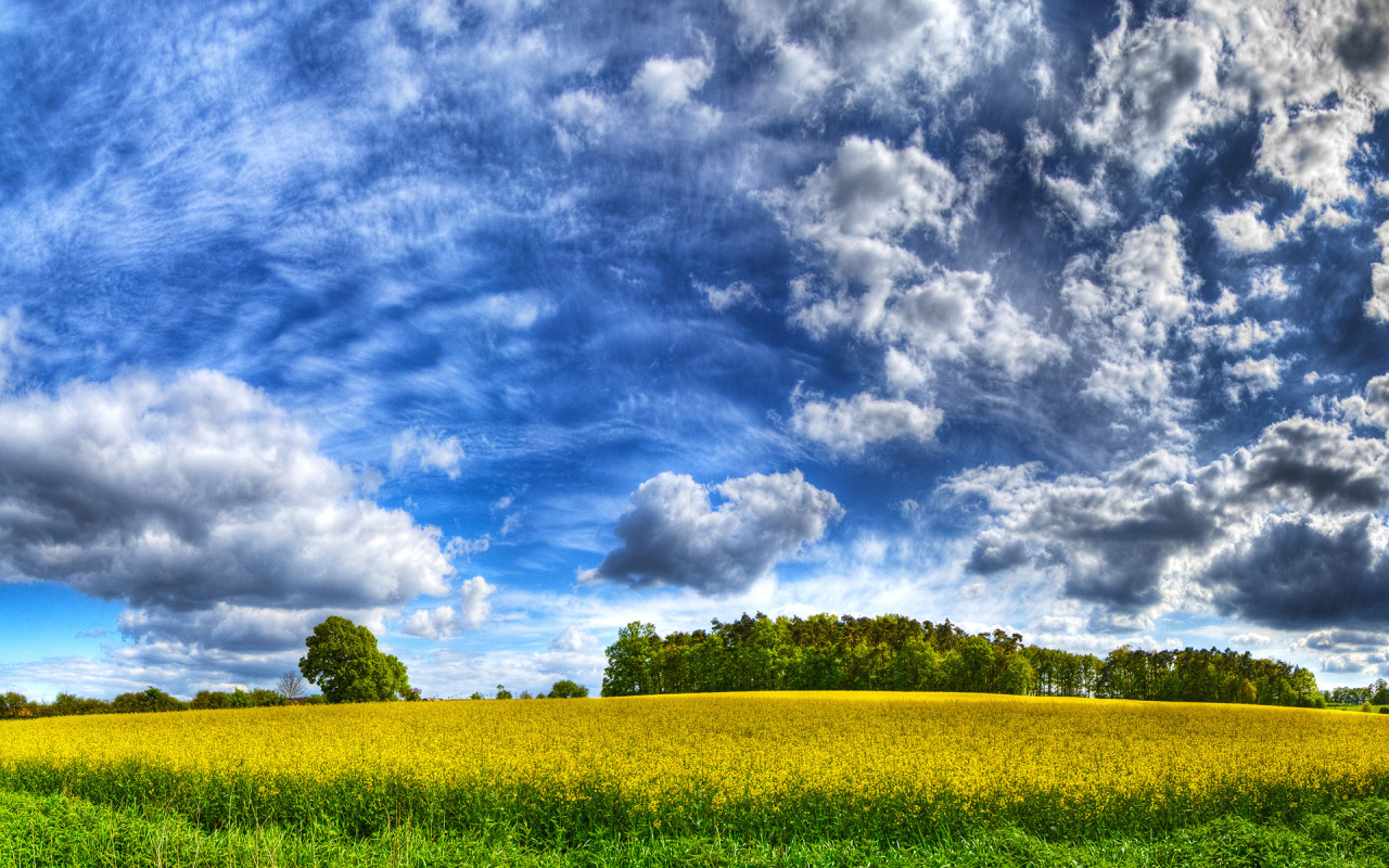
The fifth type of image is called High Dynamic Range (HDR) image. It is usually used to show finer details of objects or phenomena. Examples of this type are x-rays, cloud images, explosions and plasma. These images can be stored in 10 to 16-bit grayscale images. An example is shown in Figure 8.

Figure 9. HDR image of nature [1].

Using imread, size and imfinfo to Figure 9, the outputs are

size: 800.    1280.    3.

imfinfo:

File size -468200.   (bytes)

Width – 1280.   (pixels)

Height – 800.    (pixels)

Bit depth – 8.   (pixels)

Color Type – truecolor

However, the bit depth is 24 upon right-clicking. The size and dimensions are the same.

The sixth type of image is called Multispectral or Hyperspectral Image. These usually have bands or channel of RGB values in the order of 10. An example is shown below.

Figure 10. A Hyperspectral fluorescene image of corn leaf [2].

The details are shown below. Note that the bit depth upon right-clicking is 32.

size: 297.    471.    3.

imfinfo:

File size – 338868.    (bytes)

Width – 471.    (pixels)

Height -297.    (pixels)

Bit depth – 8.   (pixels)

Color Type – truecolor

The seventh type of image is 3D image.  This type shows the spatial information such as depth and angles and may contain two or more images. An example is shown below.

Figure 11. A 3D image of a stuff toy [3].

The specifications are shown below using size and imfinfo function of Scilab.

size:  1200.    1470.    3.

imfinfo:

File size – 2887771.    (bytes)

Width –  1470.    (pixels)

Height – 1200.    (pixels)

Bit depth – 8.   (pixels)

Color Type – truecolor

The bit depth upon right-clicking is 24. Moreover, the dimensions are consistent with the results shown above

The last image type is Temporal image or Video. This is a series of frames which has now high definition and high frame rates. An example is depicted below. The video from Youtube [4] is about different fast events or processes that are shown in slow manner.

http://www.youtube.com/watch?v=71nURVXXeaM&feature=related

The first four types of images are basic and the rest are known as advanced image types.

As I used help in the Scilab console to check for imfinfo, the only colortype available are ‘grayscale’ and ‘truecolor’. Based on what I did for this activity, I have learned that Scilab considers the image to be truecolor unless otherwise it is converted to grayscale.

The next part of this activity is to convert the truecolor image in Figure 7 to binary and grayscale. The Scilab code is shown below.

Figure 12. Scilab code for conversion from truecolor image to binary and grayscale images.

Unfortunately, there was an error than hinders the program to show the binary and grayscale images as I executed the code. The error is:

                                   –>imshow(I)
!–error 17
stack size exceeded!

                                   Use stacksize function to increase it.

                                   Memory used for variables: 7907952

                                   Intermediate memory needed: 2154566

                                   Total memory available: 10000000

                                   at line 13 of function typeof called by :
at line 22 of function char called by :
at line 28 of function imshow called by :
imshow(I)

Even when I increased the stacksize up to the maximum, 268435454, the same error appeared. I restarted my laptop and cleared the variables but the same error has appeared. I believe the image was just too large. I have encountered this type of error in the previous images for this activity. I just increased the stacksize and it worked. But for this case, I find it time consuming so I just resized my truecolor image. The new size has the following details:

File size – 314732.   (bytes)

Width –  398.    (pixels)

Height – 252.    (pixels)

The truecolor image was converted to binary images with different threshold values. The size of all the binary images despite having different appearance is 398×252 pixels. This is the same with the truecolor image of interest. It is expected since the conversion only changed the value of each pixels but not the dimensions. Moreover, there is no indicated number of channels upon using size function Scilab. This means that Scilab reads it as a binary image. These are shown below.

Figure 13. Grayscale images of the truecolor image from the resized Figure 7 with (a) 0.2, (b) 0.3, (c) 0.5, (d) 0.7 and (e) 0.9 threshold values.

Figure 13 shows that as the threshold value approaches 0, the image becomes nearly white. As the threshold approaches 1, the grayscale image darkens. The threshold value ranges from 0 to 1 only. It is because if the pixel value is greater than the threshold, it will be marked as 1 (white) and 0 (black) otherwise.

Figure 14 shows the grayscale image of the truecolor image. The pixel values for this image are ranging from 0 (black) to 255 (white) upon using rgb2gray function.

Figure 14. Converted grayscale image of the truecolor image

The next part of the activity is to convert the scanned plots from Activity 1 to grayscale and investigate the graylevel histogram of the image. The 425 x 577 scanned image is shown below. The original scanned image’s dimensions is 2004 x 2724 pixels. I reduced the size for this activity so the processing time is faster. The scanned plot is shown below.

Figure 15. Scanned image of the hand-drawn plot from Activity 1.

The image from Figure 15 was grayscaled using rgb2gray function. The imhist function was used to obtain its histogram.  The Scilab code is shown below.

Figure 16. Scilab code for the histogram analysis

The dimensions of the grayscale and truecolor images are both 425 x 577 pixels. However, the grayscale has no indicated number of channels while the truecolor has 3 channel as indicated by the size function. The corresponding grayscale image is shown below

Figure 17. Grayscale image of Figure 15.

The grayscale image from Figure 17 is investigated using histogram. Its histogram is shown below

Figure 18. Graylevel histogram of Figure 17.

From Figure 18, it can be seen that there are many pixels, about 185000 pixels out of 245225 pixels, have a pixel value of 241.57895 which is nearly white. It can bee seen from Figure 17 that the dominating color is white indeed. Then Figure 15 is converted is black and white, i.e., binary image. I used imbw function to convert it. Figure 19 shows the black and white image with a threshold of 0.5.

Figure 19. Binary image of Figure 15.

The Scilab code for this conversion to binary image is shown in below.

Figure 20. Scilab code for converting a scanned truecolor image to binary or black and white image.

For the last part of the activity, different image formats are discussed:

Graphics Interchange Format (GIF) is a format that has a limited 256-color value palette from a set of about 16 million color values. Thus, if the picture has only 256 colors or fewer, this format will store the entire image without compression, i.e., it is lossless.  Otherwise, its algorithm will reduce the colors and approximate the nearest color value of the pixels. For an image with lots of colors, GIF format will be lossy. This format are often used in web pages [5].

Portable Network Graphics (PNG) format is a lossless image format. It uses patterns in compressing the size of the image. It is usually used as web image and it can do everything that GIF can do. And sometimes, PNG is better so it might replace GIF in the future (according to [5]). However, it cannot replace JPG because the latter is good at compression while keeping a good quality of image at a small image size [5].

Tag Image File Format (TIFF) can be a lossless or lossy format. It is usually used as a lossless image format and is usually unsupported by internet browsers [5].

Joint Photographic Experts Group (JPEG, JPG for short) is usually used for photos that has several colors. It stores images with 24-bit color. It is good in finding the best compression ratio to maintain the quality of the image. One way is by omitting colors that has low probability that the human eye can notice. However, the compression of JPG can be adjusted using photo editors. By these information, JPG is a better format for photos than GIF [5]. 

Bitmap (BMP) is a protected format by Microsoft [5]. According to [5], there is no reason to use this kind of format.

Raw file (RAW), from the name itself, is an unprocessed format maintaining the quality of the image [6]. It has the original RGB pixels by the sensor of the camera as it passes through an analog-to-digital converter (ADC). Nikon calls it NEF file [7]. It is basically a lossless output image of camera. Since these are lossless, they usually take large storage space. Manufacturers have unique RAW formats so it not advantageous to use this for general purposes. The manufacturer’s software should be used to access the file [5].

Encapsulated PostScript (EPS) usually used as a screen preview. It is the only format that can use transparent white in bitmap [8].

PSD, PSP, etc., are patented formats of different graphics programs. For example, Photoshop has PSD format and Paint Shop Pro files has PSP format. These working formats are used to access the image, especially when it is complex. Editting these files by converting to other formats might lead to lossy images [5]. Windows Metafile (WMF) are files consisting of calls to Microsoft graphics [8].

From these different image formats, I have learned that even when I did my best to make an image of great quality, some information might be lost upon saving the image with the wrong format. It is very essential to look for and choose the best format for a specific case.

For this activity, I give myself a grade of 10/10 since I did everything that was tasked. Moreover, I also varied some variables which can affect the resulting images.

References

1. “HDR Sky desktop wallpapers download”, available at http://www.zastavki.com/pictures/1280×800/2009/Nature_Seasons_Summer_HDR_Sky_017902_.jpg.

2. “Biochemical Imaging”, available at http://bio.sandia.gov/solutions/imaging.html.

3. “Digital 3d Photos”, available at http://www.heuristicresearch.com/media/d3d.html.

4.”Amazing Super Slow Motion”, available at http://www.youtube.com/watch?v=71nURVXXeaM&feature=related.

5. “Digital Image File Types Explained”, available at http://www.wfu.edu/~matthews/misc/graphics/formats/formats.html.

6. “Camera RAW”, available at http://www.techterms.com/definition/cameraraw.

7.”RAW, JPEG and TIFF”, available at http://photo.net/learn/raw/.

8. “Understanding Image File Formats”, available at http://amath.colorado.edu/computing/graphics/understand_fmts.html.

9. “Acronyms & Abbreviations”, available at http://www.abbreviations.com.

10. Maricor Soriano, “A3 – Image Types and Formats”, Applied Physics 186 Laboratory Manual,  2010.